Table of Contents
- How to use Flutter Icon Widget or Flutter Icon Class ?
- How to use ImageIcon Class ?
- Coding - Sample Flutter App Code
In this guide will learn how to use :
- Flutter Icon Class (also known as Icon Widget) and Icons Class
- Flutter ImageIcon Class and AssetImage Class
How to use Flutter Icon Widget or Flutter Icon Class ?
Let us start with the simplest way to implement icons in flutter.
Icon Class - Documentation
Also refer official class documentation with this guide to deeply understand the concept.
Icon Class Constructor
Icon(IconData icon, { Key key, double size, Color color, String semanticLabel, TextDirection textDirection })
- Create a child widget of Icon class
Now, To get the IconData, Use Material Icons Class - Documentation
In the below screenshot, we can clearly see that IntelliSense auto-completion recommends us a list of icons present in the Icons Class.
To know more about VS Code IntelliSense - Docs
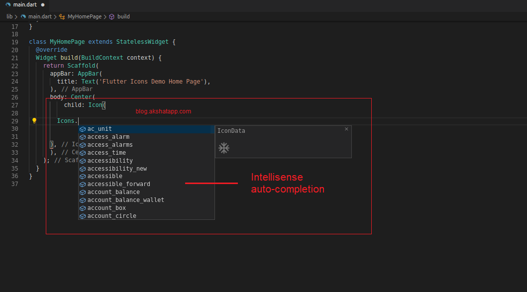 |
|---|
| Flutter - Icons Class |
“info” icon selected for this demo guide
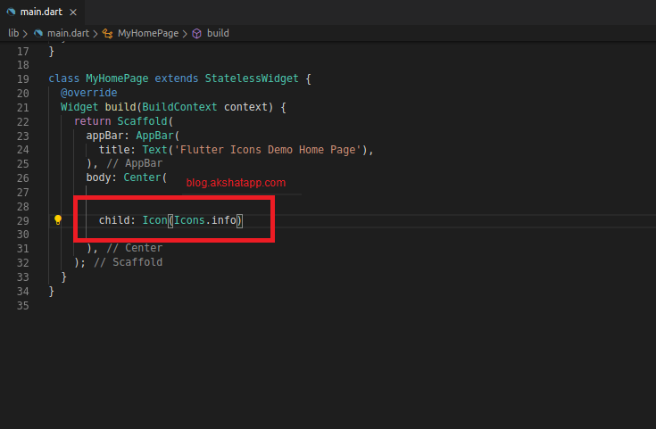 |
|---|
| Flutter - Icons Class |
Flutter UI Output
 |
|---|
| Flutter Info Icon UI |
We can also change different properties like color,size, semantic label and text direction
Icon class properties
- icon : IconData [required]
- color
- size
- semantic label
- textDirection
what is semantic label ?
- The text which will be announced in accessibility modes (eg. TalkBack/VoiceOver).
- This label will not be shown in the UI.
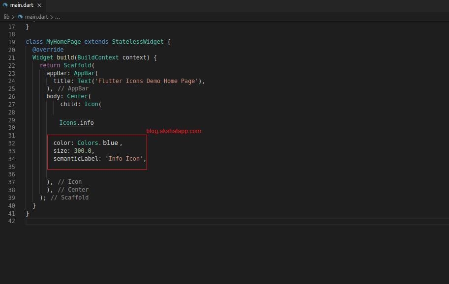 |
|---|
| Flutter Semantic Label Icon |
Flutter UI Output
 |
|---|
| Flutter Icon Demo |
Recommended icon sizes(double value) are 15.0, 20.0, 25.0 and 50.0
This is the simplest way to implement icons in flutter app using Icon Class and Icons Class
How to use ImageIcon Class ?
Using this class (ImageIcon class) we can use our own custom designed images as icons in our flutter app.
ImageIcon Class Widget - Documentation
Also refer official class documentation with this guide to deeply understand the concept.
step 1: let us add our custom images to our flutter project
- Create assets folder in your project directory
- We have added two images into assets folder for this demo guide.
- You may add images required for your project
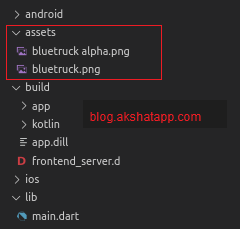 |
|---|
| Flutter Image Assets |
Also, add the image assets to your application using pubspec.yaml file
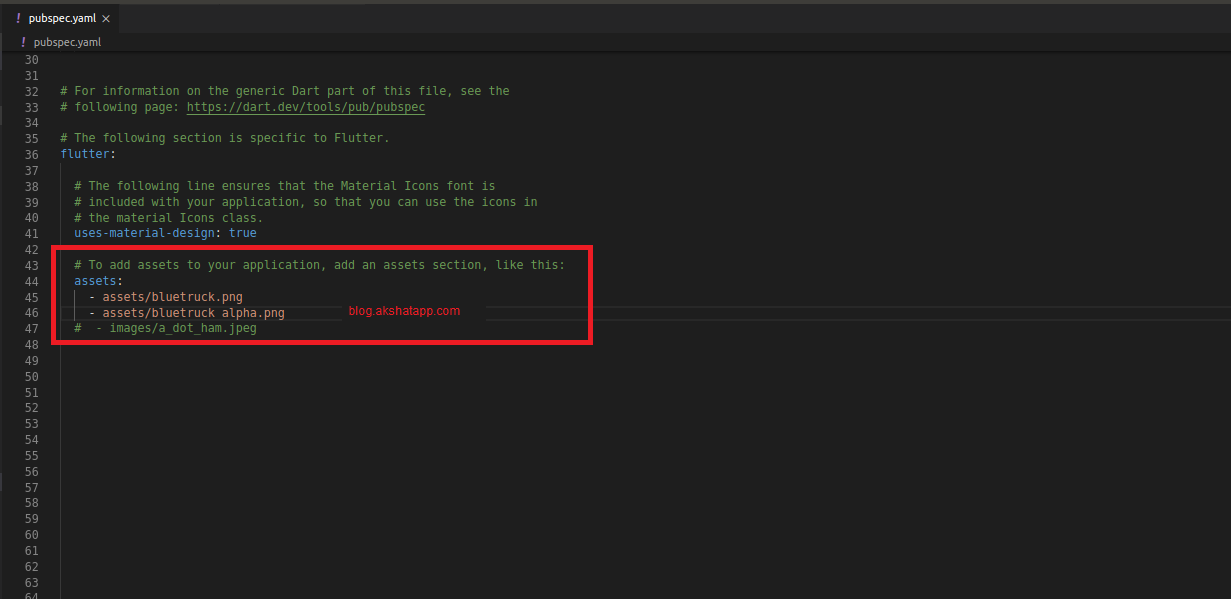 |
|---|
| Flutter pubspec.yaml |
step 2 : Alpha Channel (Transparency)
Let us first understand basics of image - color channels
Images have 4 color channels
- Red Channel
- Green Channel
- Blue Channel
- Alpha Channel (Transparency)
To use ImageIcon, we must have transparency - alpha channel in our custom images.
- Use PNG images with alpha(transparency).
- Do not use JPEG(.jpeg,jpg) as it does not support transparency.
We have added two images to our project, in step 1
Image One : Image with white background named bluetruck.png
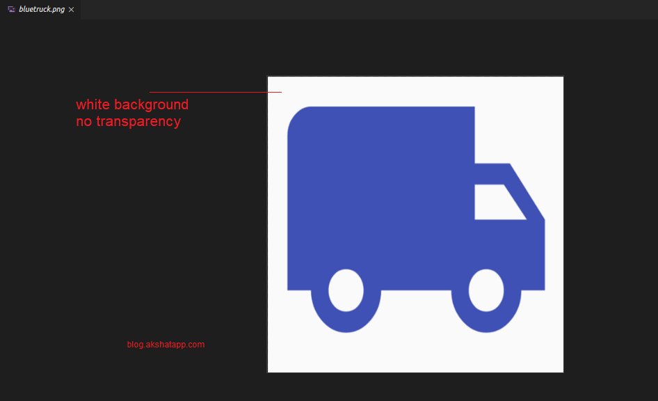 |
|---|
| Image with white background |
Image Two : Image with transparent background - bluetruck alpha.png
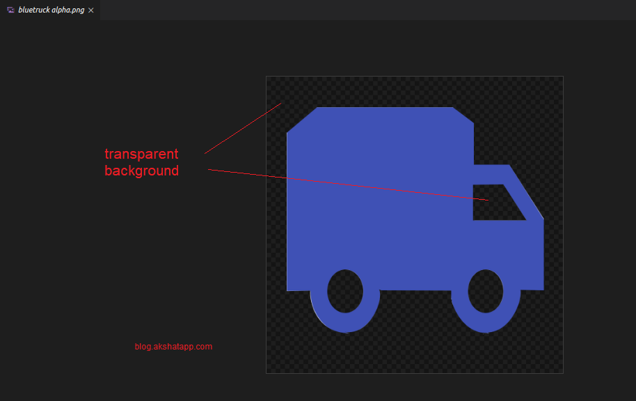 |
|---|
| Image with transparent background |
step 3 : Let us understand this with an example that why we must have transparency - alpha channel in our images
To implement the ImageIcon class, lets start with the ImageIcon class constructor
ImageIcon Constructor
ImageIcon(ImageProvider image, { Key key, double size, Color color, String semanticLabel })
In this case we do not have any IconData so we cannot use the Icons Class, instead we have ImageProvider.
for ImageProvider, use AssetImage class - AssetImage Class Docs
Use AssetImage class to get your Image.
Create a child widget named AssetImage and pass the relative image path
Case One : We use the image with white background (bluetruck.png)
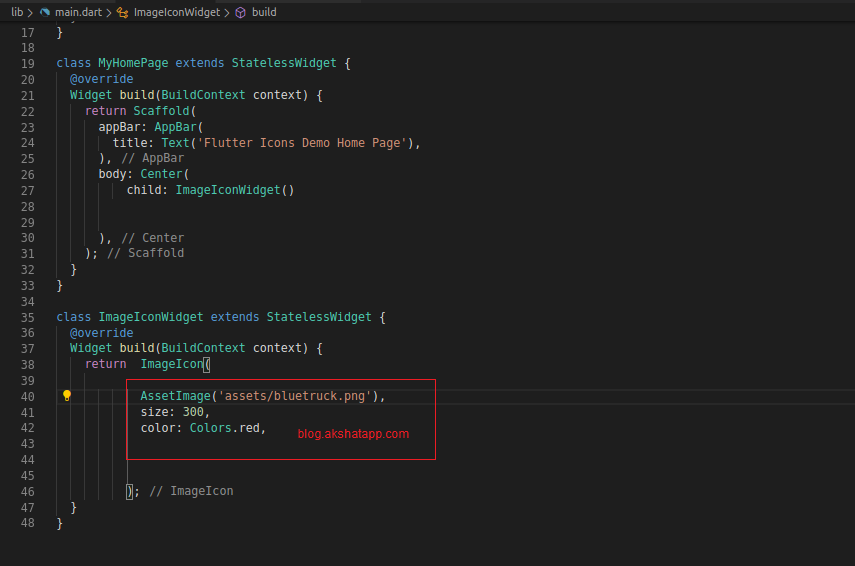 |
|---|
| AssetImage White Background |
 |
|---|
| Flutter AssetImage White Background UI |
We get a square box of red color because ImageIcon class traces and paints the icon borders.With a white background image it traces the complete square image path and paints it red as we have set color property as red.
But, this is not the desired result.
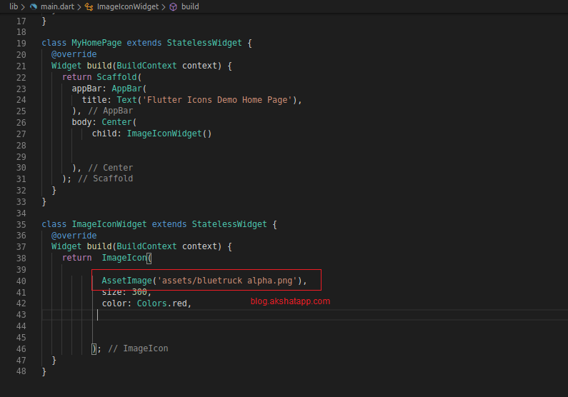
Case Two : We use the image with the transparent background (bluetruck alpha.png)
 |
|---|
| Flutter AssetImage Transparent Background |
 |
|---|
| Flutter AssetImage Transparent Background UI |
Now, with the transparent background image we get the desired UI output of a truck icon using our custom image
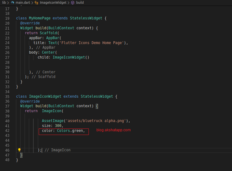
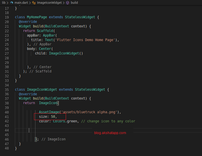
We can also change different properties like color,size, semantic label
Change Color to Green
 |
|---|
| Flutter ImageIcon Green |
 |
|---|
| Flutter ImageIcon Green UI |
Change icon size
 |
|---|
| Flutter ImageIcon Size |
 |
|---|
| Flutter ImageIcon Size UI |
Using ImageIcon Class we can use our custom image icons.
This is how we can implement icons in flutter app using ImageIcon Class and AssetImage Class.
Coding - Sample Flutter App Code
Bonus Tip : There is one more class for Interactive icons named - IconButton
But, we will cover IconButton class in the our flutter button developer guide
